MLX Expansion Team Concept
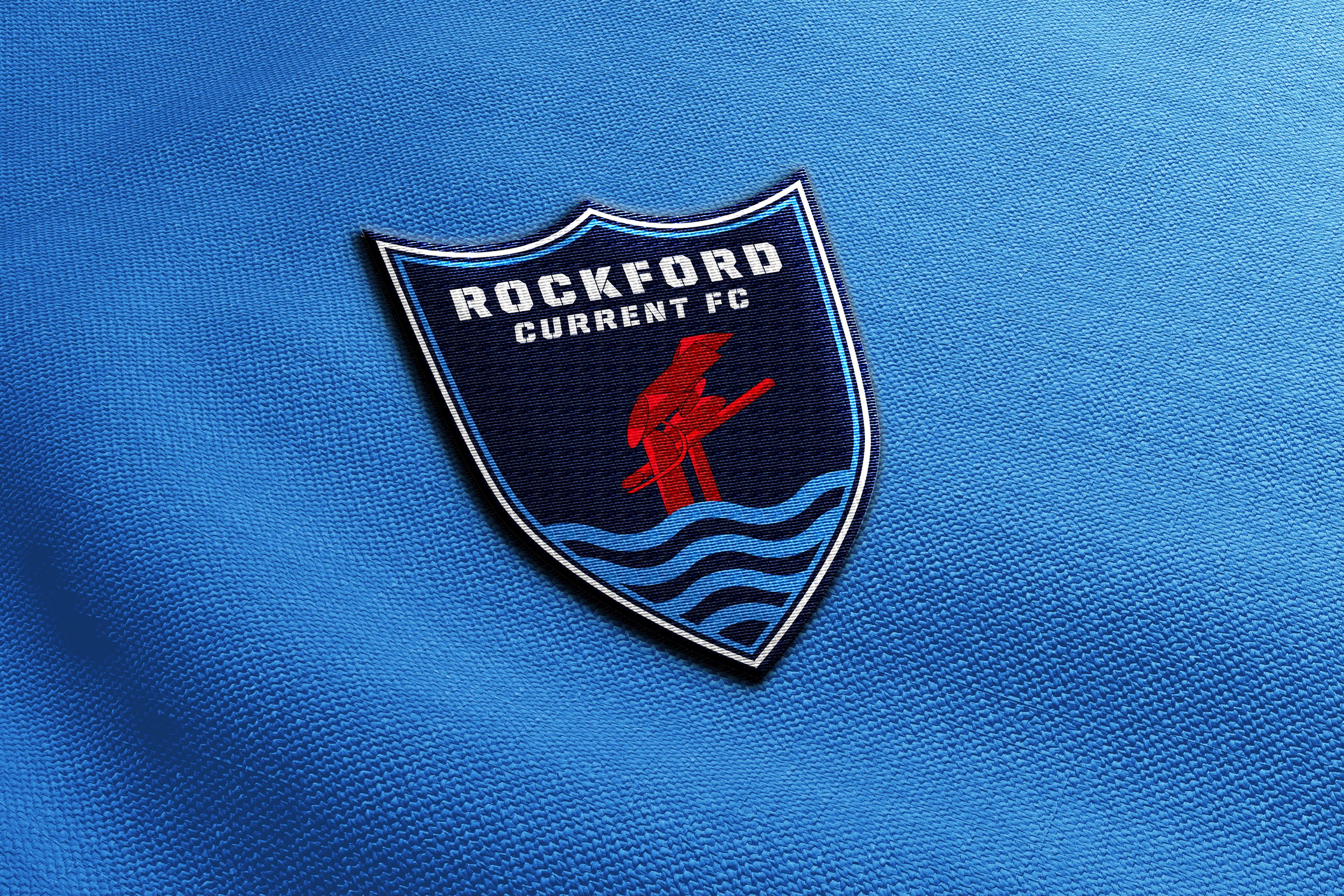
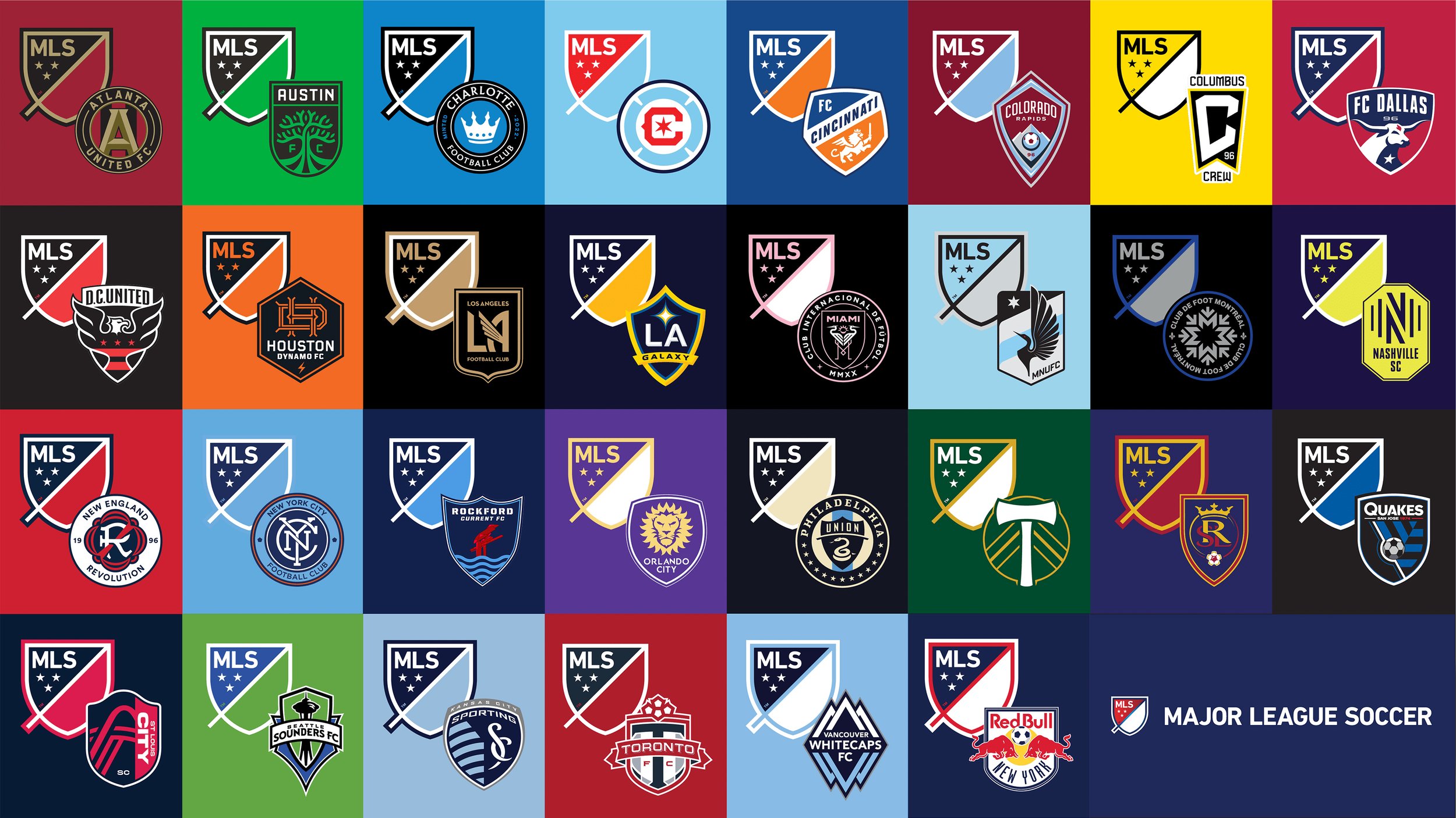
This project involves designing a logo for a potential new Major League Soccer (MLS) team based in a Midwestern city currently without a team. The goal is to create a logo that reflects the Midwest's unique fall season drawing on colors and symbols that capture autumn’s beauty and spirit, such as harvest, changing leaves, crisp air, acorns, and local wildlife. The logo aims to celebrate the Midwestern identity, connecting with local pride and evoking the excitement and warmth of fall. The design had to be both unique to the city it represents and align with the sleek, modern aesthetic typical of MLS logos.
Design Strategy
Rockford, Illinois, was chosen as the home for the new team. As the fifth most populated city in the state, with over 140,000 residents and its strong community presence, Rockford is ready for a professional sports team that can unite the city’s passionate fan base and build on its rich history.
The team name, Rockford Current FC, connects directly to the Rock River, which flows through the city and serves as an iconic element of Rockford. "Current" represents both the movement of the river and the ongoing growth of Rockford, making the name a symbol of progress and energy. The city is also home to the "Symbol", a tall red sculpture that represents Rockford’s industrial heritage. It pays homage to Rockford's industrial metal-bending factories, the traditional economic mainstay of the city. This sculpture aligns with the values of the team and reinforces the idea of resilience and innovation.
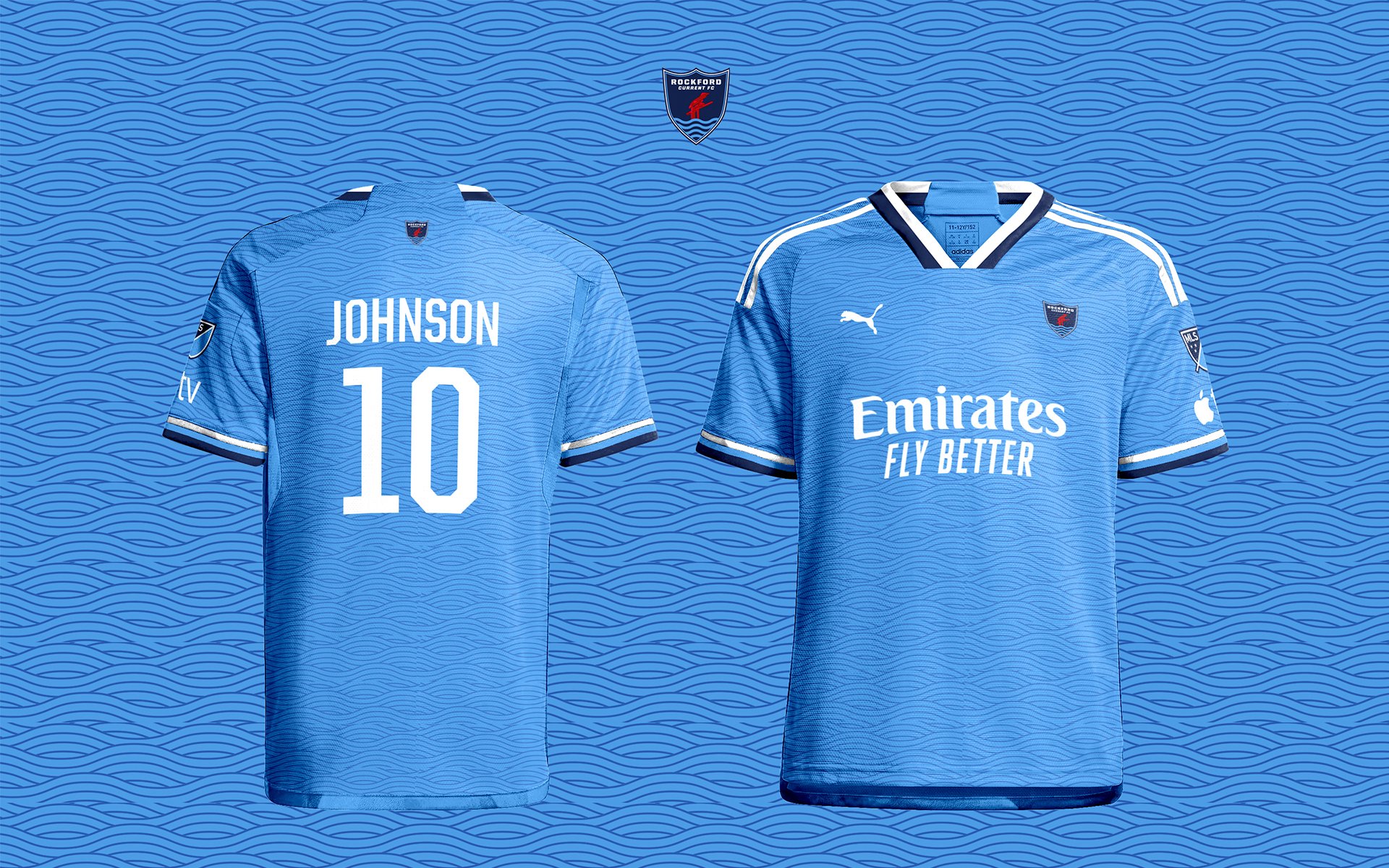
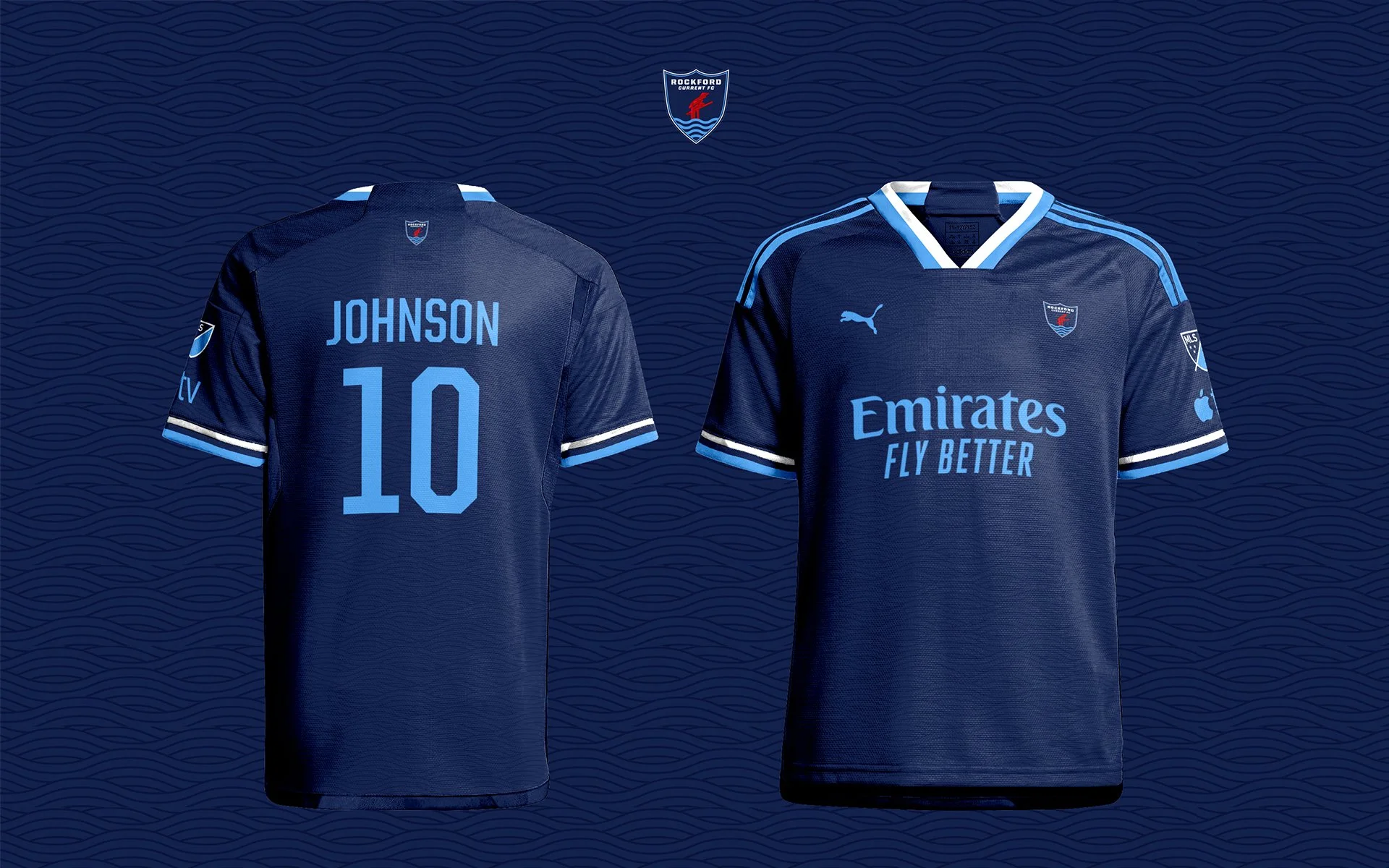
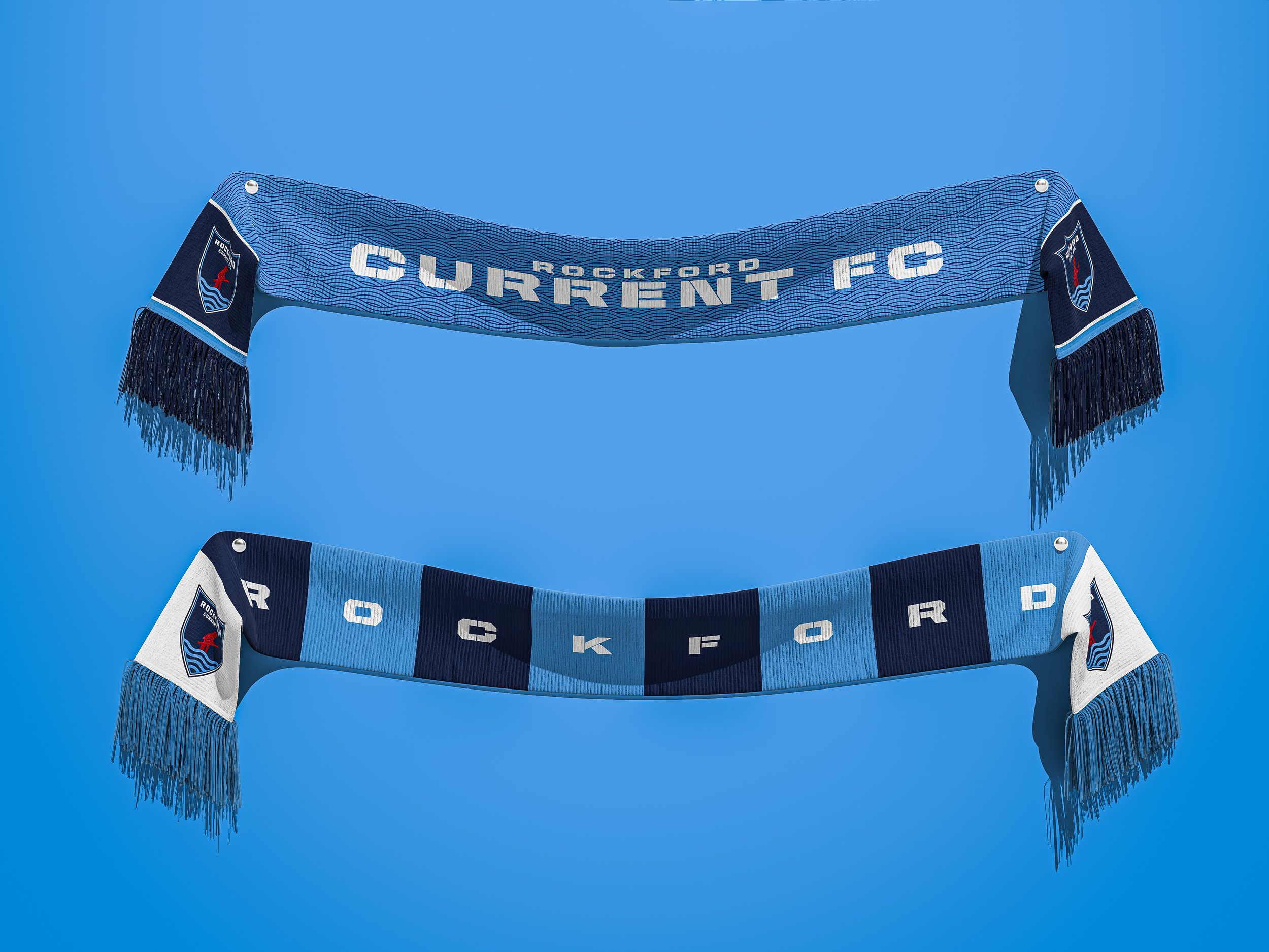
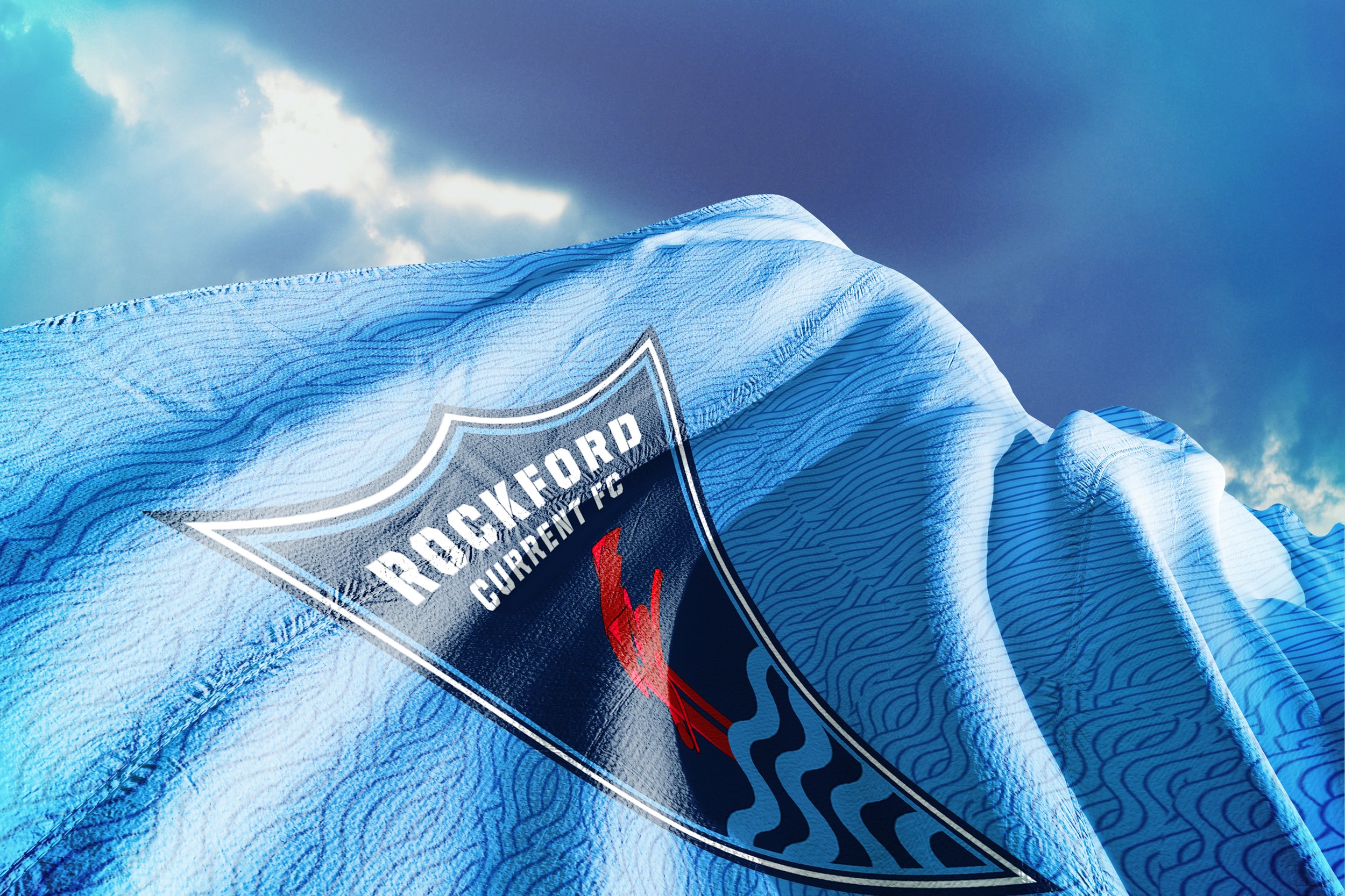
To bring this concept to life, mockups were created to showcase the brand on various applications, including soccer kits with river-inspired patterns, scarves, flags, social media graphics, and merchandise. These elements work together to form a cohesive and authentic brand that reflects Rockford’s identity and connects with its community.

